This post is primarily to communicate with Nate Hagens, the creator of The Great Simplification blog and podcast.
The contact form doesn’t allow me to send images or format my message the way I’d wish, so I’ve put the message here and sent Nate a link to this message in the hope that he will read it, act on the suggestions and improve the UX of the new look, introduced earlier today, of The Great Simplification.
The Great Simplification
I’m a keen listener to this podcast, and occasional viewer. I’ve only viewed the 5 Bend Not Break episodes on my TV.
I’ve listened to every episode up to the Daniel Schmactenberger podcast that is on AI (isn’t Bend Not Break). I listen to them on my phone’s Chrome browser.
This is the episode I was listening to
Daniel Schmachtenberger: “Artificial Intelligence and The Superorganism” – The Great Simplification
The New Look
Last night I went to bed, opened The Great Simplification (TGS) episode mentioned above, listened briefly and then paused it as I was too tired. It was the old look and feel with an audio MP3 player that easily allowed me to see how far through the audio I was with a timestamp, even with the phone in portrait orientation.
This morning I opened my phone to be greeted by the new look and feel. Overall this is an improvement. Visually it’s more appealing. The video of the podcast is now available.
But there are downsides to this change, which is what this blog post is about.
#1 No MP3 audio player
There is no MP3 audio player – the MP3 player has been removed. Only the You Tube video is available.
I find this problematic for a number of reasons.
- One of the things that TGS talks about a lot is energy use. MP3 players use less energy and consume much less bandwidth than video players.
- With the MP3 player my phone could put the screen to sleep, saving power. With YouTube it can’t. The phone keeps the screen on, consuming way more battery. Even though I’m not using the screen. This is wasteful of the energy in my phone’s battery. If I’m going for a walk just listening to this podcast is going to need a full battery (it’s 3.5 hours long).
- MP3 streaming uses a lot less internet bandwidth than video streaming. This is more data clogging the internet’s arteries for no added value. And again, more power consumption to transmit that data. In the great scheme of things, it’s nothing, but add it up across all the videos and all the listeners…
- In portrait mode the YouTube video doesn’t display timestamps. The previous MP3 player did display timestamps in both portrait and landscape orientations. Are timestamps important? Yes. I often pause mid-way through an episode and I’ll need that timestamp if I reload the page (not uncommon on a phone). Also passing a link to the page with a timestamp is something I often do when sharing.
- Why force people that are listening to stream video? This just doesn’t make sense.
#2 No MP3 download
I could live with #1 if there was an MP3 download I could grab. I could then listen to this on a walk where there isn’t signal (not uncommon in the UK, amazingly).
#3 The “Check out this podcast” popup
There is a UX failure present on the website which is a permanent popup that serves no value, but gets in the way massively when using a phone.
Here’s a screenshot from my phone when I’ve got it in landscape orientation (which let’s face it is how you view video).
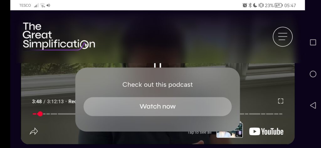
- As you can see the popup obscures the video (or if you scroll down, the transcript, etc)
- There is no way to cancel the popup.
- Clicking “Watch now” doesn’t actually play the video (which is not an unreasonable expectation), but simply scrolls you from wherever you are on the page to where the video is. You then need to click the video to make it play.
- Additionally the TGS banner image and blur effect also interfere with the video.
It’s 2025, people have been trained for 2 decades to recognise video. You don’t need this popup to “help” them. You’re actively harming the user experience with this popup.
Solution 1:
Add a [x] to the top left of the popup so that people can get rid of this popup.
If you do this it’ll be the first thing I do every time I visit your website. If you track metrics for this I suspect for phone users it will be the first thing they do. Google indicates most websites are visited by mobile devices these days.
Solution 2:
Get rid of the popup. This is a better solution than Solution 1.
The Popup on a large screen
When using a desktop machine with a 32″ the popup is irritating, but stays mainly out of the way at the lower left of the screen, but for reasons that are unexplained occupies the full width of the screen when at the top of the podcast episode.
I just don’t see any value in this popup. People know what a video player looks like. They don’t need to be “helped” like this. Treat them like adults. Get rid of the popup.
Conclusion
I appreciate that as a consumer of your podcast, you don’t owe me anything. But I do hope you take sincere feedback they way it’s intended. I’m critiquing things that I think detract from the experience of your superb podcast (TGS is the #1 podcast I listen to).